The Importance of Good Web Form Design & Usability: A Case Study
I’d like to talk a little bit about web form design and usability. If you run any kind of business with an online presence, chances are you’re going to be using web forms for some kind of interactivity on your website. From simple contact forms to blog commenting to a full e-commerce checkout, forms are the standard way to collect information about your customers. Poor website usability and design can result in lost sales and lost opportunities to engage with your customers, and this is doubly true when we’re talking about a shopping cart checkout page, online ticket system, or registration system.
A Case Study: Jack Hirose & Associates Inc.’s Online Registration System
The online event registration system for Jack Hirose & Associates is a good example of a series of forms that evolved and changed as the client received feedback. The system’s functionality hooks into a FileMaker database and uses a hosted payment page from Moneris Solutions to process credit cards. These requirements haven’t changed, but the overall visual design (and some functionality) has changed considerably since the system was first developed years ago.
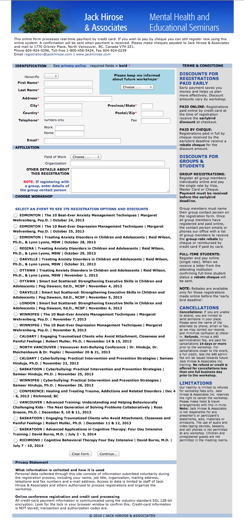
The original landing page for Jack Hirose & Associates’ online registration system
The original system had one big issue: there were a lot of people phoning in to say they couldn’t figure out how to register online. The client was dealing with a very non-tech-savvy audience here, so feedback ranged from “I can’t figure it out” to “it’s broken” to “it won’t work on my computer.” Because the client moved to an online ticketing system specifically to reduce in-office hours spent dealing with phone calls and faxes, they had a problem.
The form’s processing was primarily server-side (that is, it didn’t rely on the visitor’s web browser), and it functioned properly when tested on a variety of web browsers and operating systems. Therefore, we could deduce that there probably wasn’t anything wrong with how the forms actually worked. Rather, the signup system itself was simply too difficult for the client’s customers to figure out.
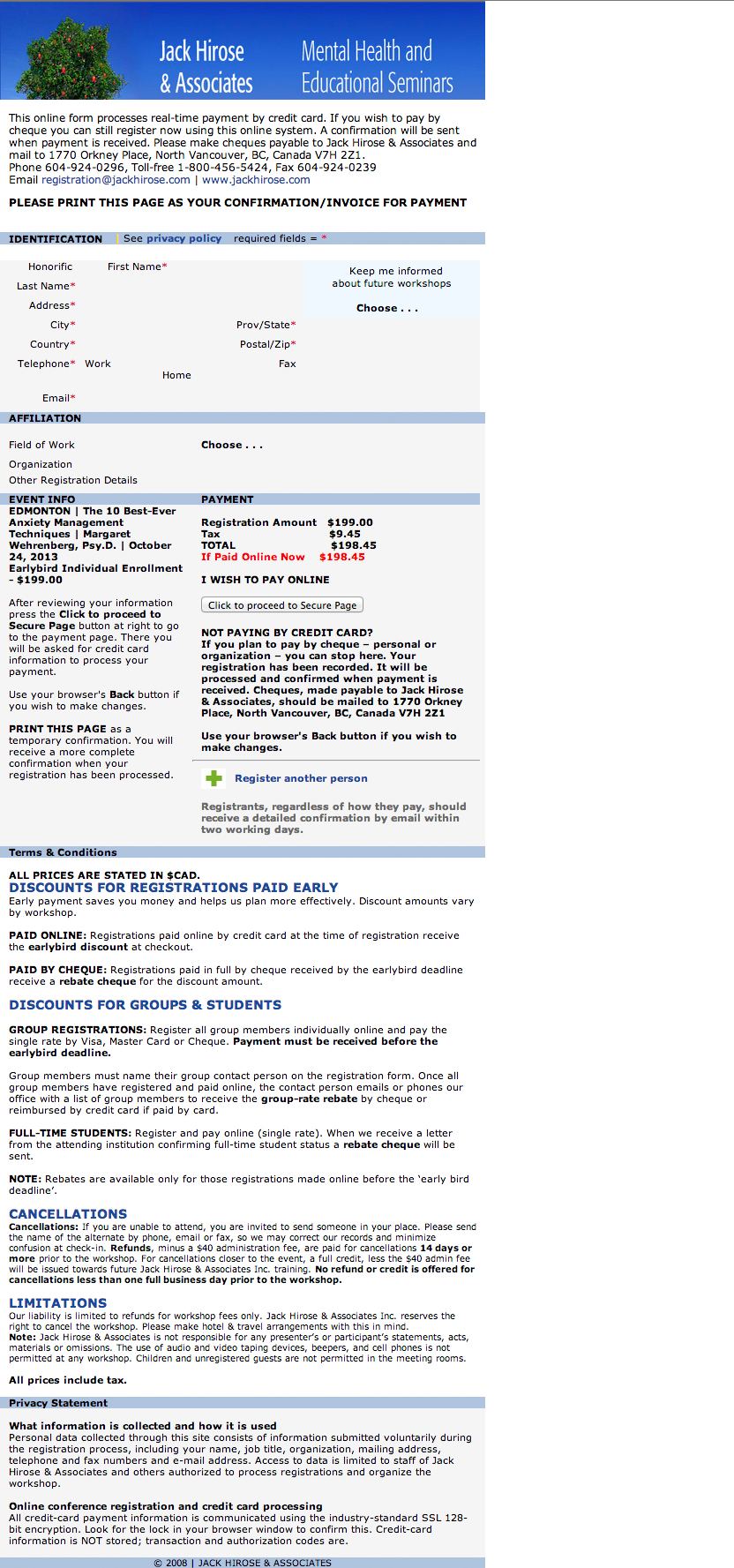
The original final confirmation page before the actual credit card step. The continue button is not easy to find at first glance.
There were a couple of issues with the original form design:
- It validated with a javascript alert and nothing else… there was no visual feedback on the page about what fields were missing or incomplete.
- Wall of text: there is little visual hierarchy between the interactive parts of the form, and all the legalese the client felt was necessary.
- You couldn’t click on the names of the events to select them, because the <label> tag wasn’t used. Therefore, you had to click on the tiny circle to pick the one you want.
- There’s a few screens to complete before you get to the final, separate credit card page. It’s not indicated anywhere how far along the process you’ve come, or how far you have to go. I believe this is why there were so many “abandoned” registrations without payment. The above screenshot shows the confirmation page displayed before the credit card payment processing page. It does give the option for the customer to stop right there, print the page as an invoice, and pay separately, but it’s not very obvious that you can also continue to pay with your credit card via Moneris.
The client and I have worked together to revise the visual design a bit (as well as with the developer to alter some of the functionality.) I’m currently working on a complete overhaul of the visual design for the entire website at jackhirose.com, including a new skin for the registration forms.
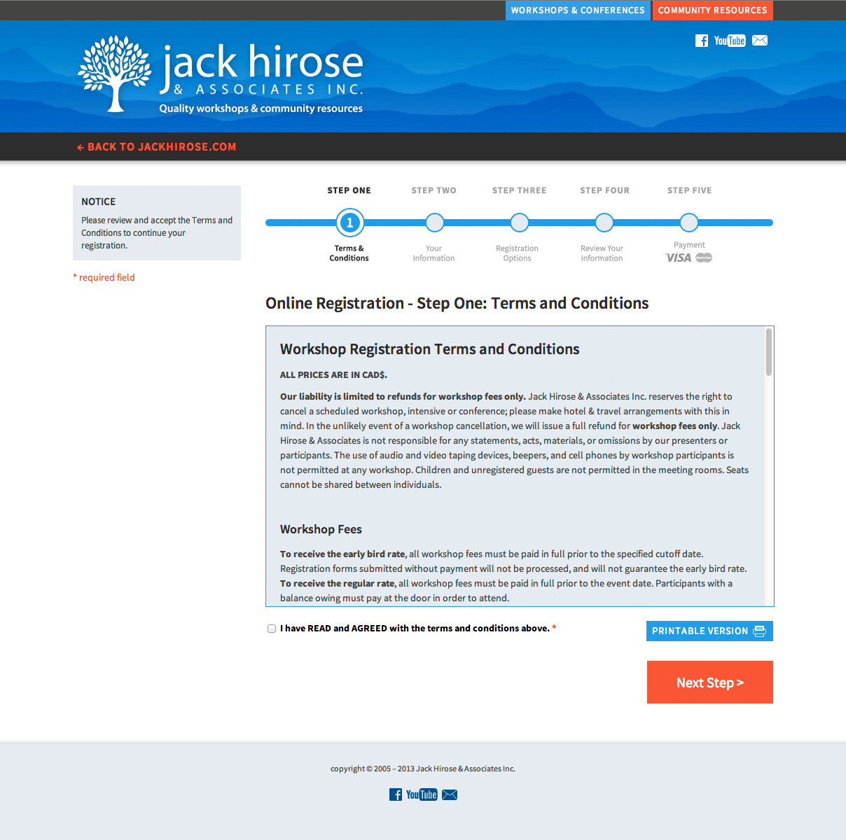
The new online registration system: Terms and Conditions page
The updated registration pages are visually seamless with the new website (which, as of this article’s writing, isn’t launched yet.) I have included a step-by-step indicator of the full registration process. The terms and conditions are such a giant wall of text, the client couldn’t be sure that customers were actually reading them. We decided to streamline everything by forcing a terms and conditions acceptance at the beginning of the registration process.
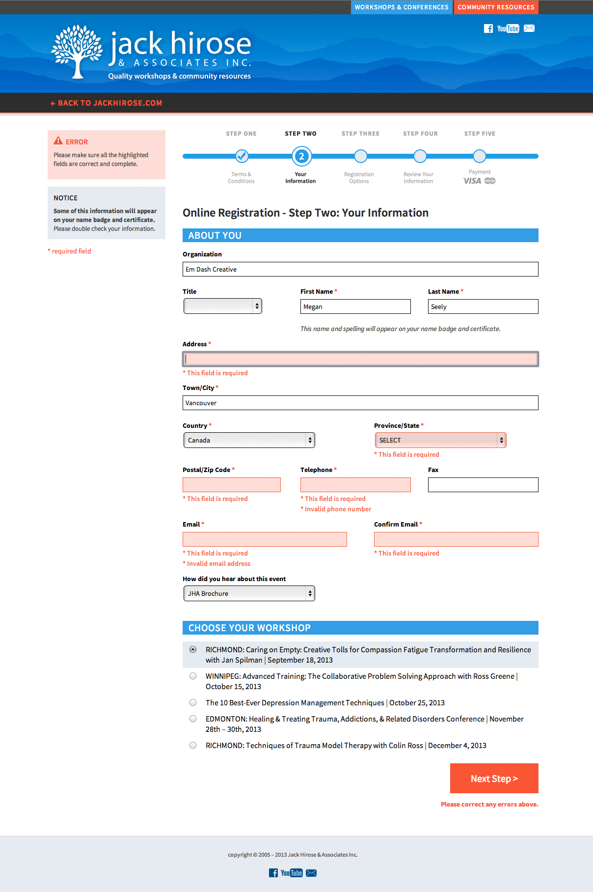
Form field validation on the new registration system
There are plenty of great form validation scripts out there, so don’t feel you need to write your own! The developer had used Validation Engine and it was already setup for me. But, I didn’t love the floating chat bubble style. Validation Engine lets you use inline error messages instead, and with some custom css, they matched my layout perfectly.
By giving some padding, margins, and a selected background to the event options, they become much easier to read and select. You can now click anywhere on the event title to select your event.
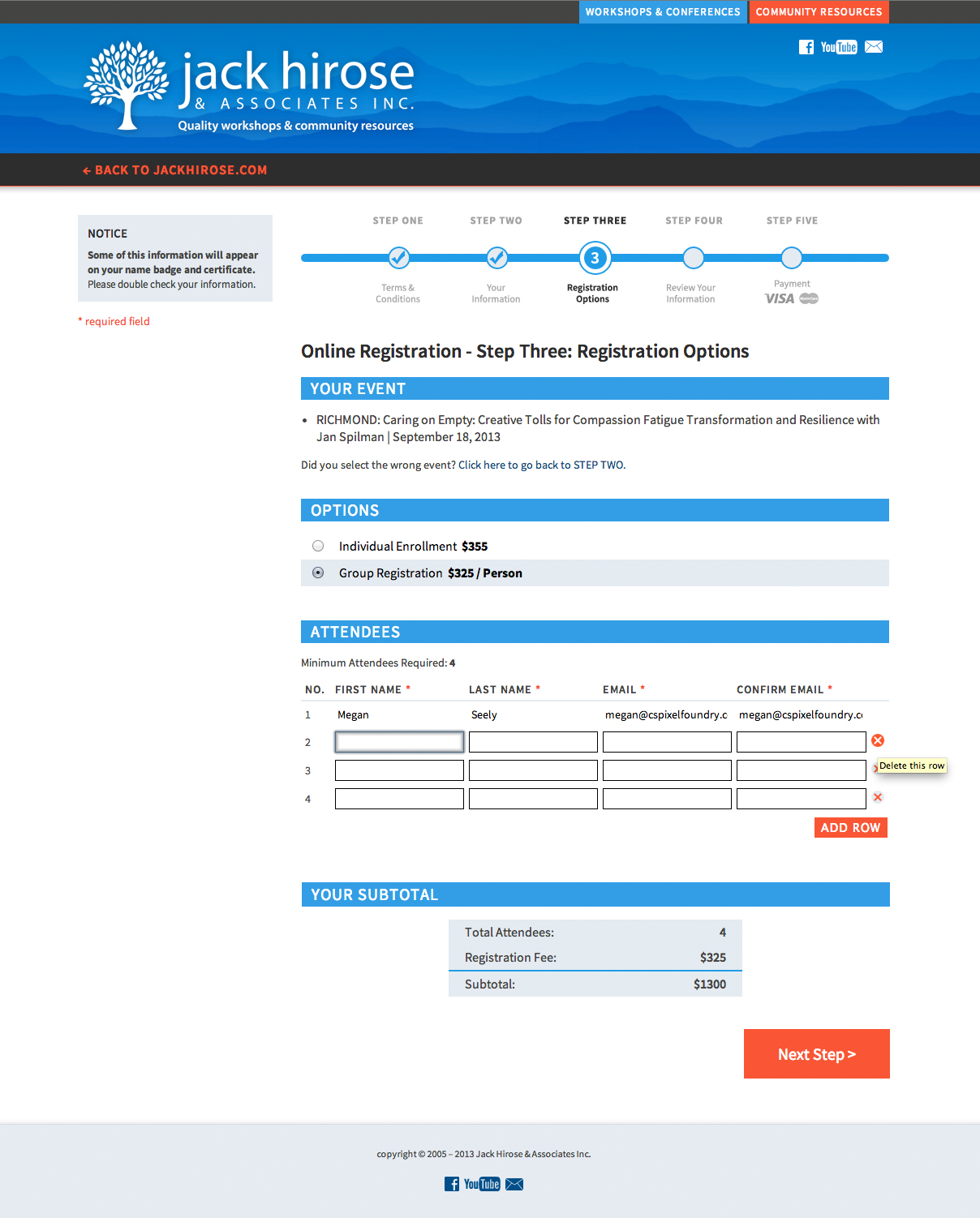
Registration options, including a subtotal area. Buttons have tooltips to help users figure them out.
Working with the developer, the client came up with a system to (optionally) register multiple people. They did a great job overhauling this part of the registration process and making it easy to use. I added tooltips on the buttons that add/remove attendees from the form, just in case they’re confused about how to proceed.
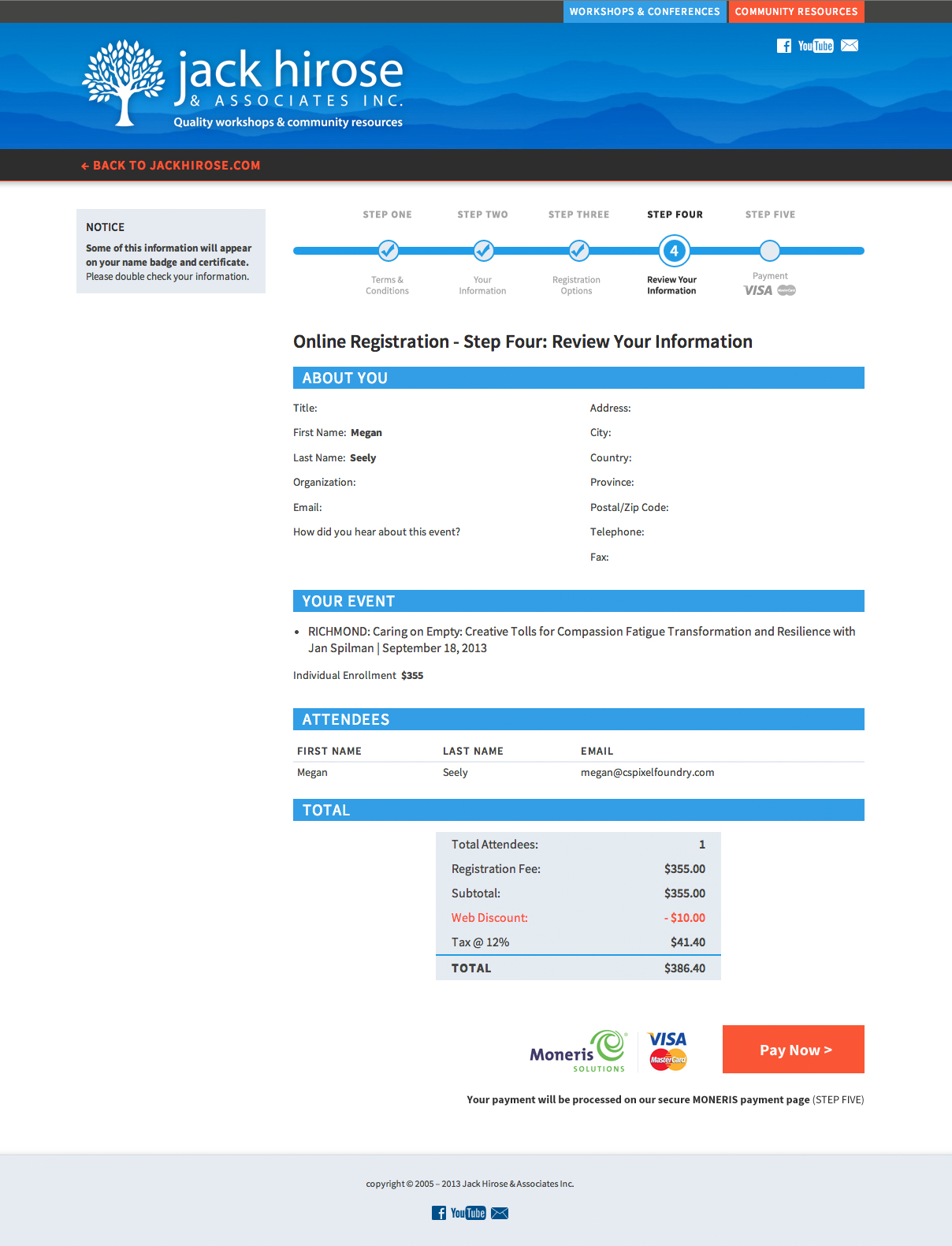
The final confirmation page before payment processing. Compare with the original above; the new design makes it more obvious there’s a final step.
Because the client is using a Moneris hosted payment page, the system transfers the customer to a visually different website. It was important to make it clear to the customer that this is normal behaviour. By changing the button text to “Pay now” and using the Moneris/VISA/MasterCard logo, the new design sets up the expectation that you’ll now be directed to use your credit card.
I’m not completely finished skinning the new registration system, and it may not launch for a few more weeks. I expect there’ll be lots more tweaks down the road as more customers use the forms and offer their feedback. Registration and checkout systems, and websites for that matter, should be treated as an organic thing that will grow and evolve with your business and the needs of your customers.
Additional credits: Original development by Steve St. Laurent. New registration system development by Acculogic Technologies.
Em Dash’s Form Basics for Web Developers and Designers:
- Every single element should give you some kind of indication that it can be interacted with. For example, a text field should highlight when you click on it. A submit button should change your cursor when you hover your mouse overtop. It’s easy to neglect these things when coding and designing a form, because we’re used to our web browsers handling this stuff for us. But a lot of this default usability behaviour can be accidentally disabled, especially if you’re using a css reset.
- It’s easy to get carried away redesigning the web browser’s default elements – maybe you want the select dropdown to look a certain way, or a custom scrollbar, or cute checkboxes. The website’s audience might not be able to interpret your design, however. They’ve become very used to use Firefox’s default controls (or Internet Explorer’s or whatever) and now you’ve given them a whole new interface to decipher. If you’re going to redesign UI elements, make sure they match standards closely enough that they’ll be easy to figure out.
- Labels, labels, labels. I see forms all the time that are just transparent input boxes overtop a background image. The background image is flattened to include the form field labels. Yes, this gives you absolute control over the appearance of your form. But it’s a horrible practice, and renders the form useless to anyone who uses accessibility software.
- Radios and checkboxes need labels – ever see a form where you have to actually click the tiny stupid circle to select an item, and the text label itself isn’t clickable? That’s because they’re not using a <label> tag or it’s incorrectly marked up. (Labels need to indicate which ID they are for.) Make life easier for your website’s visitors and make it easy to select options.
- Check your tab order. I’ve been guilty of forgetting this too – it’s one of those things we’re used to web browsers doing for us. You can set the tab order (tabindex) on any input, textarea or select element. If you’ve got columns or floated elements in your form, chances are your tab order is incorrect as well.
- Make your submit button obvious. Make it big. Make it colourful. Give it white space around it so the visitors know where it is.
- Some forms have a “Reset” button that erases all the form’s information. I can’t imagine any circumstances where someone would even want to do that, and I can imagine a lot of circumstances where it gets pressed accidentally and makes your poor website visitor start over. Leave reset/erase buttons out of your form design.
- Make your validation messages obvious. Ad blocking and popup blocking software can hide javascript alerts. Give your visitors a message on the page, and highlight the fields they forgot to complete. Use an attention-grabbing colour to emphasize what’s wrong. Make sure no field data is removed when the validation runs – there’s nothing more annoying than constantly having to type your information out every time the captcha is incorrect.
- Speaking of captchas, stop making them too difficult for real people. I see this:
 and it just annoys me. There are simpler ways to test if a human is completing your form.
What are some of your pet peeves about bad web form design/usability?